Container
The Container element used to be the only layout element in Bricks until version 1.5. It has now been extended by the Section, Block, and Div element to provide a more maintainable & streamlined layout creation process.
The Understanding the Layout article covers in more detail how to best use the layout elements in Bricks.
How To Use The Container
Section titled “How To Use The Container”The Container has a default width of 1100px, is centered, and uses the flexbox layout model. This provides various settings to easily direct, align, and space out the elements inside a Container.
We recommend using the Container at the root level or inside a Section.
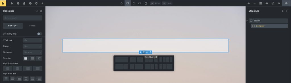
When editing the Container, you can click the “column” layout icon on the canvas to quickly insert a pre-designed column-based layout:
Let’s explore the container capabilities and go over a few container layout examples in the video below:
Convert your pre-1.2 Bricks layout to Containers
Section titled “Convert your pre-1.2 Bricks layout to Containers”If you’ve built your site prior to version 1.2 using the “old” section, row, and column layout, you first need to convert your data to the new container layout.
Bricks comes with a built-in container migrator that migrates your existing Bricks data to the new container layout with one-click. So you don’t have to re-create your entire site from scratch.
As the new container layout is fully flexible and does NOT have a pre-defined concept of “sections”, “rows” or “columns” you most likely have to make some manual adjustments after running the migrator.
After updating to Bricks 1.2 your old data will still be rendered on the frontend, but it’s not a 100% accurate representation of your existing section layout.
Once you’ve updated to Bricks 1.2+, please convert your existing Bricks data as soon as possible as outlined in the step-by-step migration guide below.
We highly recommend migrating your pages one by one, to ensure you don’t miss reviewing any of your migrated pages.
As an extra precaution, you can also clone your existing site or editing it on a staging server first, and perform the migration there (rather than on any live site).
The migrator does NOT delete any of your existing (section) Bricks data. If you feel Bricks 1.2 and the migrator are not ready for your site yet, you can always download a previous version of Bricks (like 1.1.3) from your Bricks account to roll back and continue using the section, row, column layout for now.
STEP #1: View your un-migrated data on the post type screen
Section titled “STEP #1: View your un-migrated data on the post type screen”All un-migrated posts/pages/templates, etc. all marked as such by the “(not migrated)” label behind the title. As you can see in the screenshot below, we need to migrate a page named “Blank”:
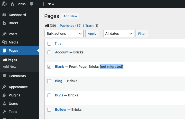
Page “Blank” needs to be migrated
STEP #2: Select your page and run the migrator
Section titled “STEP #2: Select your page and run the migrator”Now select the page you want to migrate, click on the “Bulk actions” dropdown. Select “Migrate Bricks Data” and click “Apply” to run the migrator:
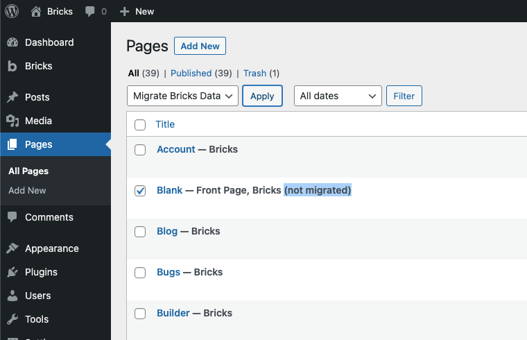
Select and apply the “Migrate Bricks Data” bulk action
STEP #3: Review the migration result
Section titled “STEP #3: Review the migration result”To inspect the results of the one-click migrator, edit your migrated page with Bricks, and perform any necessary adjustments inside the builder. Then preview your changes on the frontend as well, to ensure your layout matches your expectations.
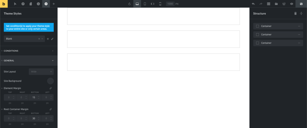
Migration tips:
Section titled “Migration tips:”- Restore the default section margin-bottom of 30px under: Theme Styles > General > Root Container Margin
- Restore the default element margin-bottom of 15px under: Theme Styles > General > Element Margin
Settings
Section titled “Settings”-
Grid column (text) - CSS grid column span when parent uses grid layout. Controls
grid-columnproperty. -
Grid row (text) - CSS grid row span when parent uses grid layout. Controls
grid-rowproperty. -
Query loop - Enable query loop functionality for dynamic content. Available for Container, Block, Div, and Section elements.
-
Link (link) - Link settings when using anchor tag. Required when HTML tag is set to ‘a’.
-
HTML tag (select) - HTML tag for the container element. Options: div, section, a [Link], article, nav, ol, ul, li, aside, address, figure, custom. Default: div.
-
Custom tag (text) - Custom HTML tag when “custom” is selected. Without attributes. Required when HTML tag is ‘custom’.
-
Display (select) - CSS display property. Options: flex, grid, block, inline-block, inline, none. Default: flex.
Grid Layout (when Display is grid)
Section titled “Grid Layout (when Display is grid)”-
Gap (number with units) - Gap between grid items. Controls
grid-gapproperty. -
Grid template columns (text) - CSS grid template columns. Supports dynamic data and variables.
-
Grid template rows (text) - CSS grid template rows. Supports dynamic data and variables.
-
Grid auto columns (text) - Grid auto columns size. Supports dynamic data and variables.
-
Grid auto rows (text) - Grid auto rows size. Supports dynamic data and variables.
-
Grid auto flow (select) - Grid auto flow direction. Options: row, column, dense.
-
Justify items (justify-content) - Grid justify items alignment.
-
Align items (align-items) - Grid align items alignment.
-
Justify content (justify-content) - Grid justify content alignment.
-
Align content (align-items) - Grid align content alignment.
Flex Layout (when Display is flex)
Section titled “Flex Layout (when Display is flex)”-
Flex wrap (select) - Flexbox wrapping behavior. Options: No wrap, Wrap, Wrap reverse.
-
Direction (direction) - Flexbox direction (row/column). Controls
flex-directionproperty. -
Align self (align-items) - Align self for this flex item. Controls
align-selfproperty with!important. -
Align main axis (justify-content) - Justify content alignment. Controls
justify-contentproperty. -
Align cross axis (align-items) - Align items alignment. Controls
align-itemsproperty. -
Column gap (number with units) - Gap between flex columns. Controls
column-gapproperty. -
Row gap (number with units) - Gap between flex rows. Controls
row-gapproperty. -
Flex grow (number) - Flex grow factor. Minimum: 0. Controls
flex-growproperty. Default placeholder: 0. -
Flex shrink (number) - Flex shrink factor. Minimum: 0. Controls
flex-shrinkproperty. Default placeholder: 1. -
Flex basis (text) - Flex basis value. Supports dynamic data and variables. Controls
flex-basisproperty. Default placeholder: auto.
- Order (number) - Flexbox order. Minimum: -999. Controls
orderproperty. Default placeholder: 0. Available when display is not ‘none’.
These controls can be accessed under the Style tab in the element settings.
Masonry
Section titled “Masonry”- Masonry layout (checkbox) - Enable masonry layout for child elements.
- Columns (number) - Number of masonry columns. Default: 3. Controls
--columnsCSS property. - Spacing (number with units) - Spacing between masonry items. Default: 10px. Controls
--gutterCSS property. - Horizontal order (checkbox) - Enable horizontal ordering in masonry layout.
- Transition: Duration (number with units) - Animation duration for masonry transitions. Default: 0.4s. Set to “0” to disable default animations.
- Reveal animation (select) - Animation type for masonry items. Options: Scale, Fade, Slide from left, Slide from right, Skew. Default: Scale. Only applies to new items added to the DOM.