Color Manager
The Color Manager lets you define and maintain color tokens for your site. Each color is stored as a CSS variable and can optionally support dark mode, shades, harmonies, and utility classes.
It is designed to help you build a predictable color system instead of setting isolated and impossible to maintainable hex values across your elements.
Getting started
Section titled “Getting started”To access the Color Manager:
- Open the builder
- Click the “Gear” icon on the left-hand site of the builder toolbar
- Open the “Colors” tab to access the Color Manager
If you don’t have any palettes yet, you’ll see a prompt to create your first one from scratch or to import an existing color palette (JSON file).
Creating and managing palettes
Section titled “Creating and managing palettes”Creating a new palette
Section titled “Creating a new palette”- Click the Add Palette button (plus icon)
- Enter a name for your palette (e.g., “Brand Colors” or “Website Theme”)
- Click Create
Switching between palettes
Section titled “Switching between palettes”Use the dropdown at the top to select different palettes
Renaming or deleting palettes
Section titled “Renaming or deleting palettes”- Click the Edit button (pencil icon) in the toolbar
- To rename: Click in the palette name field and type a new name
- To delete: Click the Delete button (trash icon) and confirm
Adding colors to your palette
Section titled “Adding colors to your palette”Adding a new color
Section titled “Adding a new color”- Scroll to the bottom of the color list
- Enter a variable name (like “primary” or “brand-blue”)
- Pick a color using the color picker or type in a color value
- Click Add color
Editing existing colors
Section titled “Editing existing colors”Click on any color’s name or value to edit it
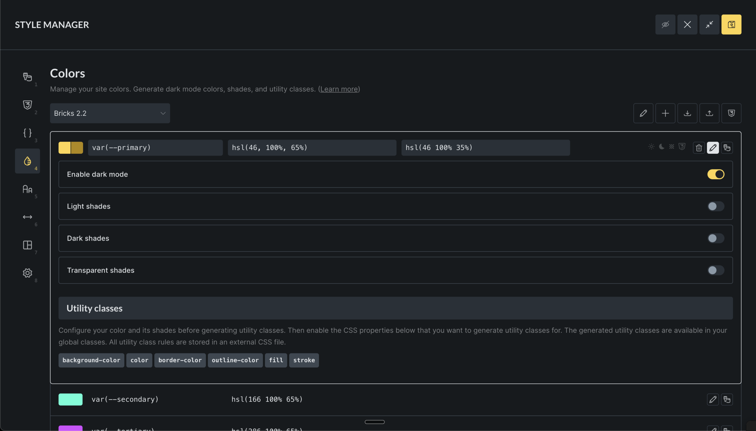
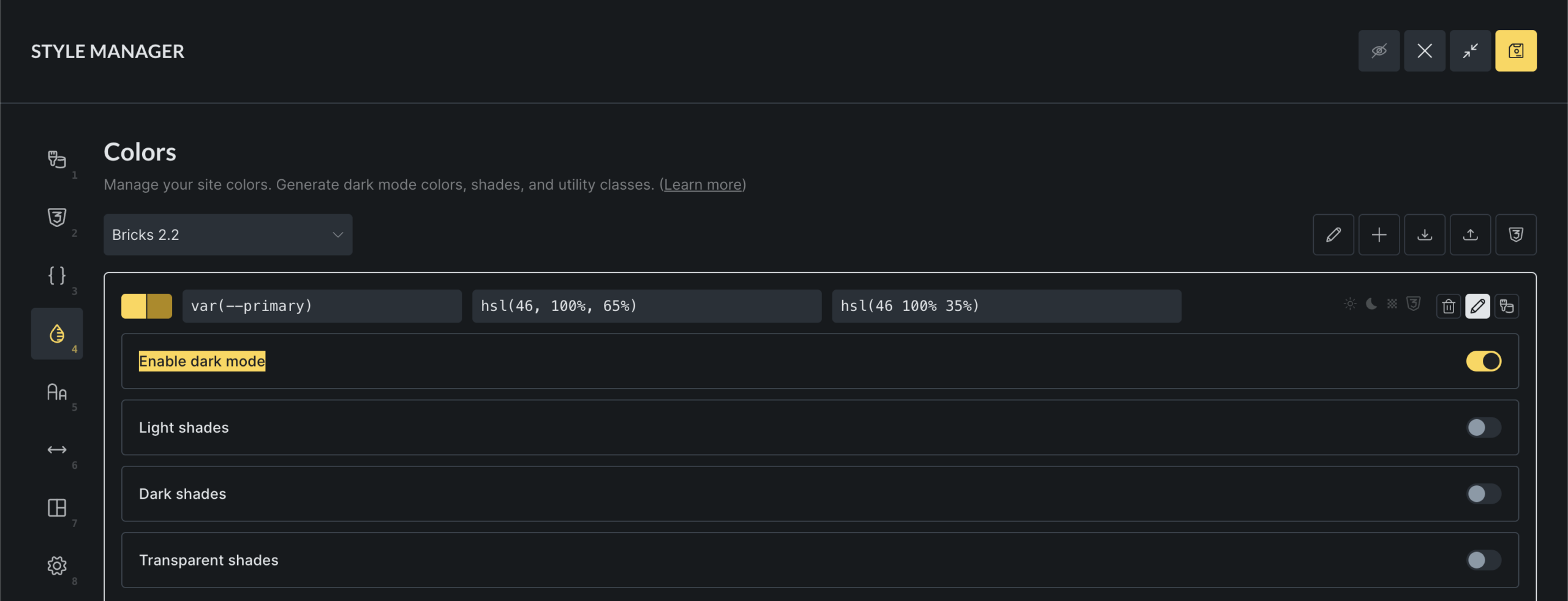
Using dark mode
Section titled “Using dark mode”Dark mode lets you define different colors for light and dark themes:
- Click the “Edit” icon on any color
- Check the “Enable dark mode” box
- Set a separate color for dark mode using the color picker
- The color swatch will show both light and dark versions
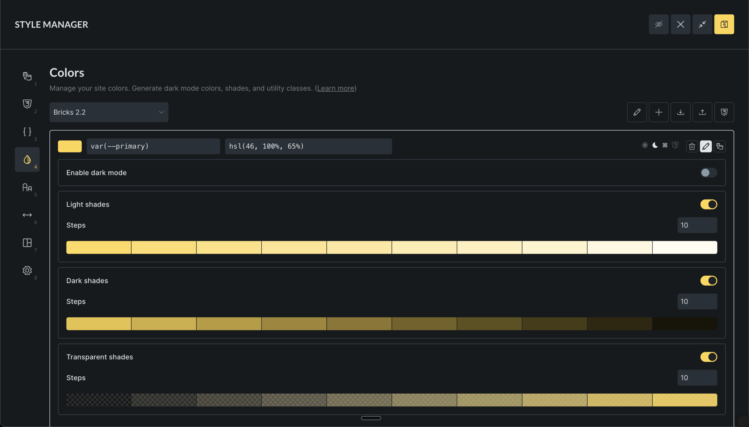
Creating color shades
Section titled “Creating color shades”Shades are variations of your base colors with different lightness or transparency:
- Click the “Edit” icon on any color
- Enable the shade type you want to create
- Light shades: Brighter versions of your color
- Dark shades: Darker versions
- Transparent shades: Semi-transparent versions
Generating color harmonies
Section titled “Generating color harmonies”Color harmonies create matching color combinations automatically:
- Select a base color
- Click the Harmony button (design palette icon)
- Choose a harmony type:
- Analogous: Colors next to each other on the color wheel
- Monochromatic: Different shades of the same color
- Complementary: Colors opposite each other
- Split Complementary: One complementary color split into two
- Triadic: Three colors evenly spaced
- Tetradic: Four colors in a rectangle pattern
- Preview the generated colors
- Click Generate colors to add them to your palette
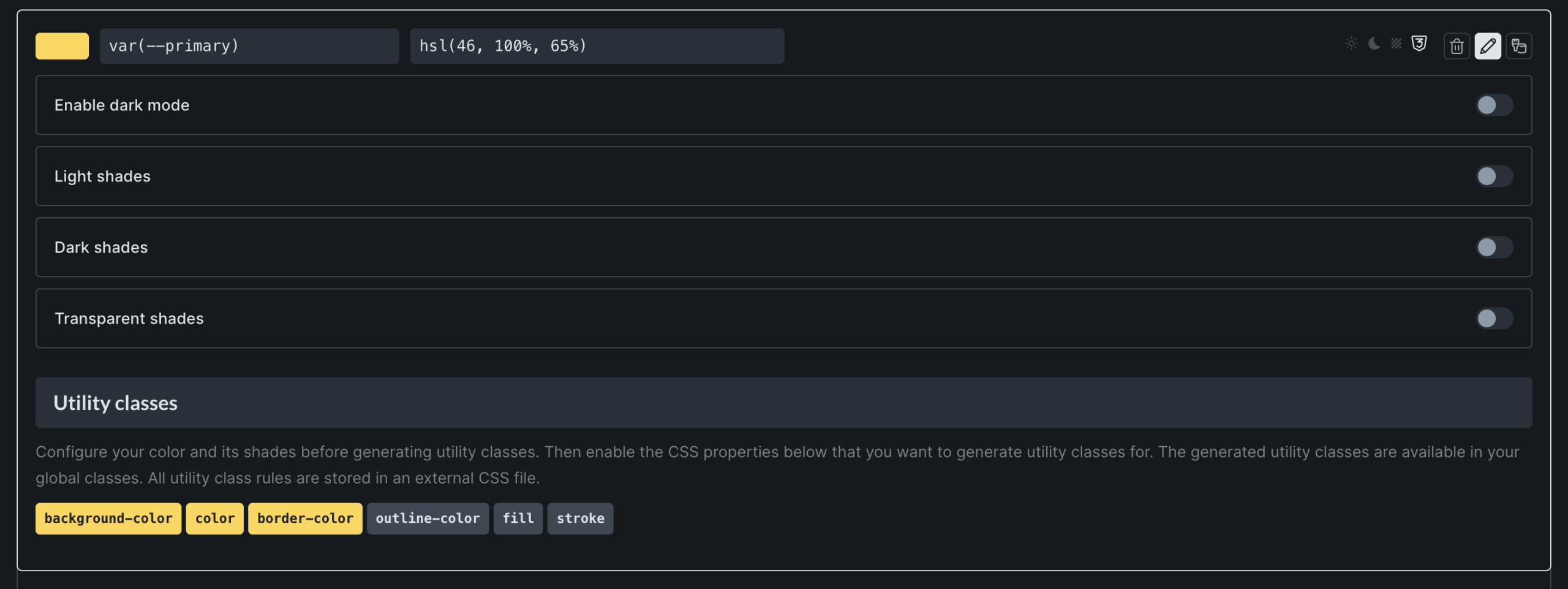
Setting up utility classes
Section titled “Setting up utility classes”Utility classes let you quickly apply colors to elements without custom CSS:
- Edit a color
- Scroll down to “Utility classes”
- Check the boxes for the properties you want:
- Background: For background colors
- Text: For text colors
- Border: For border colors
- Outline: For outline colors
- Fill: For SVG fill colors
- Stroke: For SVG stroke colors
Once enabled, you’ll have classes like bg-primary, text-primary, etc available to you when editing elements.
Importing and exporting palettes
Section titled “Importing and exporting palettes”Importing palettes
Section titled “Importing palettes”- Click the Import button (download icon)
- Drag and drop a JSON file or click to browse
- The system will validate and import your colors
- You’ll see success or error messages for each imported palette
Exporting palettes
Section titled “Exporting palettes”There are two ways to export your colors:
- Click the Export button (upload icon) to export as JSON (to import into other Bricks sites)
- Click the “Generated CSS” button to copy the generated CSS