Global classes
Theme Styles handle element defaults beautifully. But what about reusable utility styles you want to apply on demand? Things like centering text, adding shadows, or creating button variations?
This article goes a bit deeper than some earlier ones. If you’re in a hurry, you can skim now, get a feel for what global classes are, and come back later when your projects start to feel repetitive.
That’s where global classes excel. They’re your custom CSS class library, built visually in Bricks and reusable anywhere with a click.
What are global classes?
Section titled “What are global classes?”A CSS class is a collection of styles you can apply to any element. Instead of styling each element individually, you create a class once and apply it wherever needed.
Example: You create a class called .shadow-large that adds a drop shadow. Now you can apply that shadow to buttons, images, cards, or any element instantly, without redefining the shadow styles each time.
Global classes are vital for building scalable, maintainable sites. They ensure consistency and speed up your workflow dramatically.
Why global classes matter
Section titled “Why global classes matter”Imagine you have 20 buttons across your site. Without classes, you’d style each button individually (20 times). If your client wants to change the button style, you’d update each one manually. That’s tedious and error-prone.
With a global class:
- You create
.btn-primaryonce - You apply it to all 20 buttons
- When styles need to change, you edit the class once
- All 20 buttons update automatically
This is how professionals build sites that scale.
The problem global classes solve
Section titled “The problem global classes solve”Let’s demonstrate with a real example. Say you want two headings on different pages to have the same blue color and bold weight.
Without classes:
- Style the first heading (color: blue, weight: 700)
- Navigate to the second page
- Style that heading the same way
- Repeat for every similar heading
If you decide blue should be purple later, you hunt down every heading and change it manually.
With global classes:
- Create a class
.heading-blue(color: blue, weight: 700) - Apply it to both headings with one click
- Later, edit
.heading-blueto be purple - Every heading using that class updates instantly
This is the efficiency gain. You style once, apply everywhere.
Creating your first global class
Section titled “Creating your first global class”Let’s create a utility class to demonstrate the workflow.
Set up the example
Section titled “Set up the example”- Create a new page or open an existing one
- Add two Heading elements on the page
Right now, if you want both headings to look identical, you’d style each one individually. Let’s use a global class instead.
Create the class
Section titled “Create the class”- Select the first heading
- Look at the panel on the left. At the top, you’ll see the element name and an ID field below it (shows something like
#brxe-abc123) - Click that ID field
- In the input that appears, type:
heading-feature - Press Enter or click the Save (floppy disk) icon
Notice the field now shows .heading-feature (with a dot, indicating it’s a class, not an ID).
You’ve just created a global class. Now every style you apply to this heading gets added to the .heading-feature class, not just this specific element.
Style the class
Section titled “Style the class”With the heading still selected and the class applied:
- Under Typography, set Font size to
32 - Set Font weight to
700 - Set Color to a vibrant blue (
#0066ff) - Under Spacing, add Margin bottom of
20
These styles are now stored in the .heading-feature class.
Apply the class to another element
Section titled “Apply the class to another element”Now let’s apply this class to the second heading:
- Select the second heading
- Click the ID field at the top of the panel
- Start typing
heading-feature - You’ll see it appear in the autocomplete dropdown
- Select it or press Enter
The second heading instantly matches the first. Same font size, weight, color, and spacing. You didn’t retype any settings. You just applied the class.
Change the class, update everything:
- Select either heading (both use the class)
- Change the color to purple (
#9333ea) - Both headings update immediately
This is the power of global classes. Style once, apply everywhere, update globally.
Understanding the difference: ID vs. class styles
Section titled “Understanding the difference: ID vs. class styles”By default, when you select an element and apply styles, they’re added to that element’s unique ID. Those styles only affect that one element.
When you create and apply a global class, styles go into the class instead. Now every element using that class inherits those styles.
Important: ID styles override class styles (CSS specificity). If you apply a class to an element but then add individual styles to that same element, the individual styles win.
Best practice: Use global classes for shared styles. Use element-specific (ID) styles only for unique, one-off adjustments.
Building a utility class system
Section titled “Building a utility class system”Now that you understand the concept, let’s build some useful utility classes. These are small, single-purpose classes you can combine for maximum flexibility.
Text alignment classes
Section titled “Text alignment classes”Create these three classes:
.text-center
- Create a Heading element
- Add the class
text-center - Under Typography, set Text align to
Center - Delete the heading (we only needed it to create the class)
.text-left
- Same process, set Text align to
Left
.text-right
- Same process, set Text align to
Right
Now you can center any text element instantly by applying .text-center.
Spacing utility classes
Section titled “Spacing utility classes”Create a set of margin classes for consistent spacing:
.mb-sm (margin bottom small)
- Set Margin bottom to
16
.mb-md (margin bottom medium)
- Set Margin bottom to
32
.mb-lg (margin bottom large)
- Set Margin bottom to
48
Do the same for margin top (.mt-sm, .mt-md, .mt-lg) if you want.
These simple classes speed up spacing dramatically. Instead of typing margin values repeatedly, you apply a class.
Button variation classes
Section titled “Button variation classes”Let’s create button style variations:
.btn-outline
- Add a Button element
- Apply the class
btn-outline - Under Style, remove the Background color (make it transparent)
- Under Border, add a border:
2pxsolid, color#0066ff - Set Text color to
#0066ff - Add Padding of
12top/bottom,24left/right - Set Border radius to
8
.btn-ghost
- Similar to outline, but with no border
- Just text color and padding
- Subtle hover effect (set
:hoverstate to add background)
Now you can create button variations instantly by swapping classes.
Managing global classes
Section titled “Managing global classes”As your class library grows, organization matters.
View all classes
Section titled “View all classes”Press Cmd/Ctrl + . to open the Style Manager (or click the Styles icon in the toolbar). Navigate to the Classes tab.
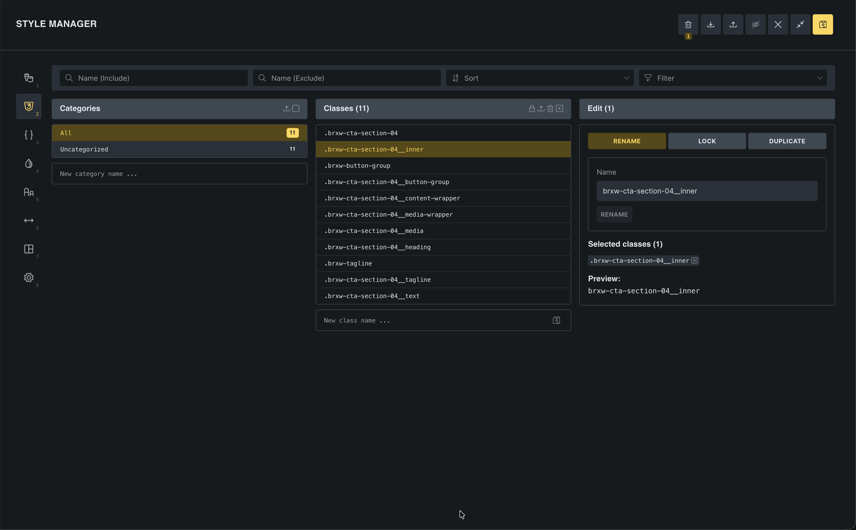
Here you can:
- See all your global classes
- Edit, rename, or delete classes
- Search for specific classes
- See where classes are used
- Export/import classes
Edit a class
Section titled “Edit a class”In the Style Manager’s Classes tab:
- Find the class you want to edit
- Click the Edit (pencil) icon
- Modify styles in the panel
- All elements using that class update immediately
Delete unused classes
Section titled “Delete unused classes”The manager shows which classes are used and where. If a class isn’t used anywhere, you can safely delete it to keep your library clean.
Real-world example: styling different elements the same way
Section titled “Real-world example: styling different elements the same way”Here’s a common scenario that shows why global classes are essential.
The problem
Section titled “The problem”You’re building a landing page. You want:
- Headings in the hero section
- Headings in the features section
- Headings in testimonials
All should be the same shade of blue with the same weight. That’s three headings on one page, each needing identical styles.
Without classes: Style each heading individually (tedious, hard to maintain).
With classes: Create .heading-accent, apply it to all three headings. Done.
The evolution
Section titled “The evolution”Later, the client asks: “Can we make those blue headings purple instead?”
Without classes: Hunt down all three headings, change each one individually, hope you didn’t miss any.
With classes: Edit .heading-accent, change the color once. All three update. You’re done in 10 seconds.
This example scales to hundreds of elements across dozens of pages. Global classes keep everything manageable.
Combining classes
Section titled “Combining classes”You can apply multiple classes to one element. This is powerful for composing styles.
Example: Apply both .heading-feature and .text-center to a heading. It gets the feature heading styles (color, weight, size) plus center alignment.
This modular approach gives you maximum flexibility with minimum duplication.
Pseudo-selectors: hover states and more
Section titled “Pseudo-selectors: hover states and more”Global classes support pseudo-selectors like :hover, :focus, :active, and more.
Creating a hover effect:
- Create a class
.btn-primary - Style the default state (background: blue, text: white)
- Change State to
:hover - Darken the background color
- Add a subtle scale transform (under Transform in advanced controls)
Now every button with .btn-primary has that hover effect. You defined it once.
Quick mention: advanced features for scaling
Section titled “Quick mention: advanced features for scaling”As you grow with Bricks, you’ll discover features that complement global classes:
Variables - Also inside the Style Manager, the Variables tab lets you define CSS variables (colors, spacing scales, font sizes) that you can reference in your classes. Change a variable, update every class using it.
Components - Turn entire layouts (not just styles) into reusable, synchronized blocks. Think of them as global classes for structure + content + styles.
These advanced features build on the same principle: define once, reuse everywhere, update globally. Master global classes first, then explore these when your projects demand more.
What you’ve learned
Section titled “What you’ve learned”You can now:
- Create global classes and understand why they matter
- Apply classes to multiple elements for consistency
- Build utility classes for text alignment, spacing, and button styles
- Manage classes inside the Style Manager
- Use pseudo-selectors like
:hoverin classes - Combine multiple classes on one element
- Understand the difference between ID-specific and class-based styling
Global classes are how you build sites that scale. They transform your workflow from repetitive styling to efficient system-building.