Theme styles
We just built a hero section, but it needs better spacing. Instead of adding padding manually to every section (slow and inconsistent), let’s set a global rule using Theme Styles.
Theme Styles are your site-wide design system. They control the default look of every element. Under the hood, Bricks writes the CSS for you. Instead of hand-coding section { padding: 80px 16px; }, you set it visually once and it applies everywhere.
Create a theme style
Section titled “Create a theme style”- Click the Styles icon in the toolbar (or press
Cmd/Ctrl + .) - Click the Select: Theme Styles dropdown and enter a name for the theme style
- Click the “Create” icon
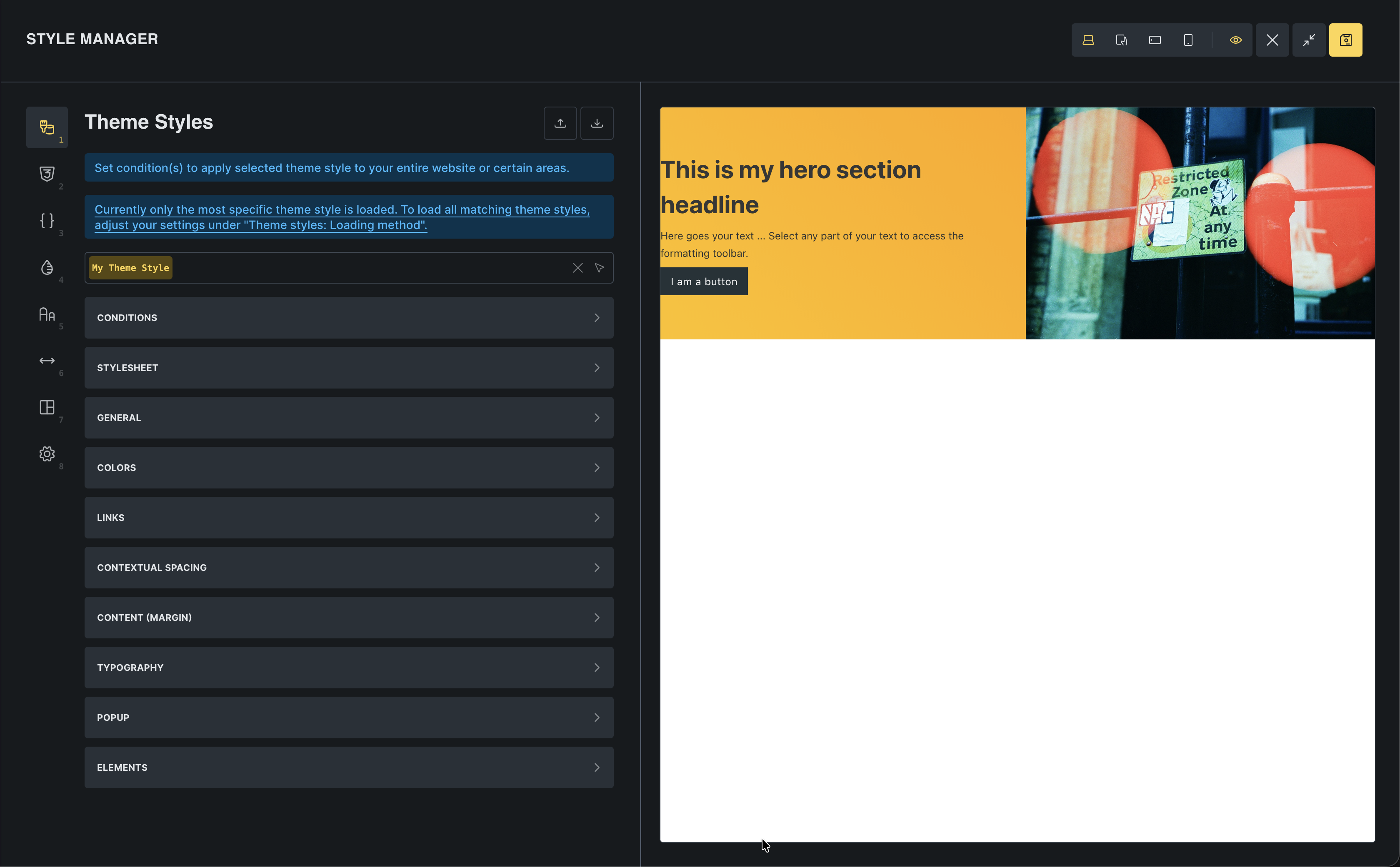
This opens the Style Manager. This is the central place in Bricks for managing your design system. You will notice it has several tabs: Theme Styles, Classes, Variables, Colors, Typography, Spacing, Framework, and Settings. We will focus on Theme Styles for now and come back to the others as you need them.
Set global section spacing
Section titled “Set global section spacing”We want every section to have consistent padding and spacing.
- In the Theme Styles panel, go to Element > Section
- Set Padding:
- Top:
80 - Bottom:
80 - Left:
16 - Right:
16
- Top:
- Set Row gap to
32
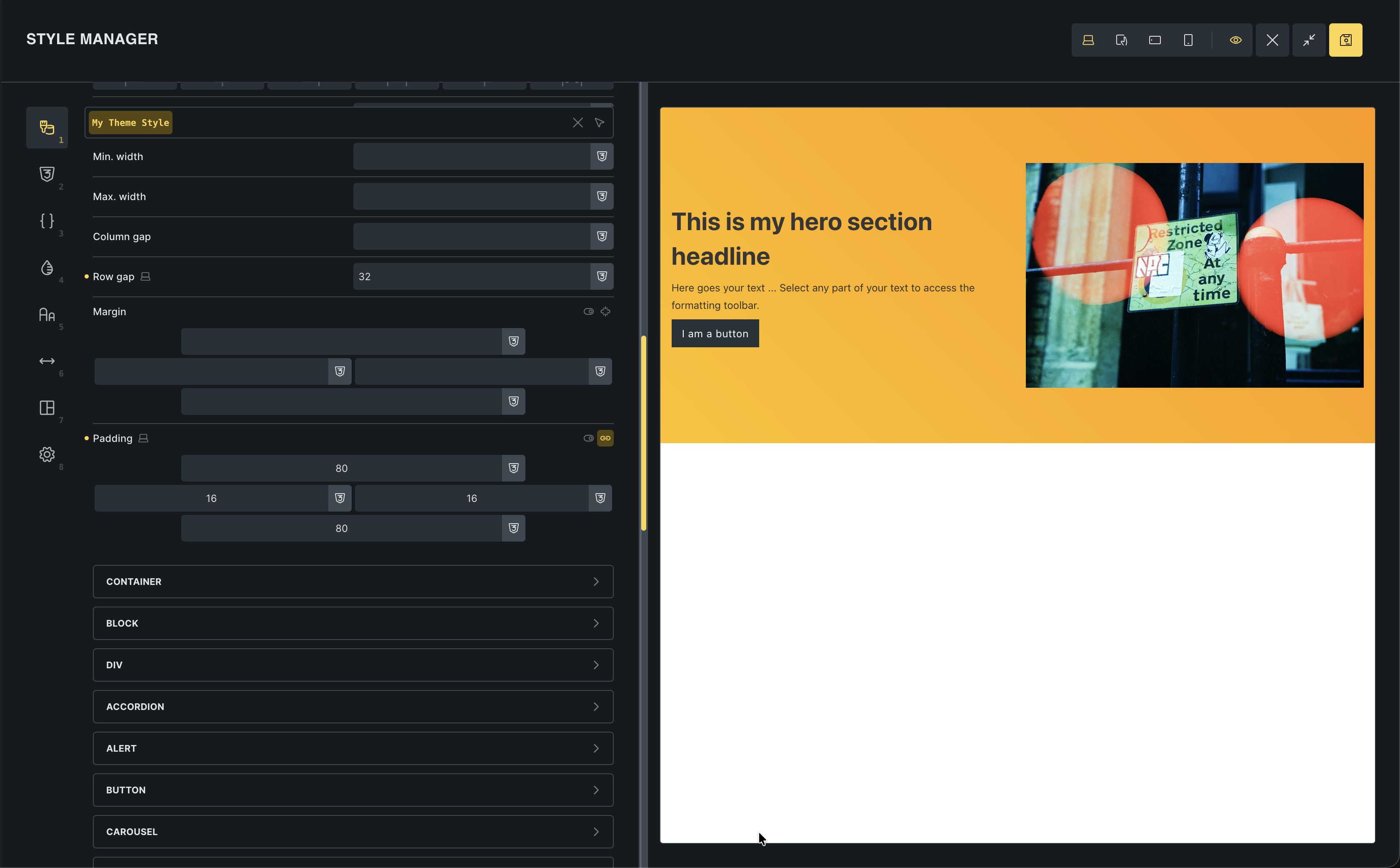
Watch the canvas: Your hero section immediately updates with the new padding! You didn’t touch the section itself; you just changed the global rule.
Now, every new section you add will automatically have this perfect spacing.
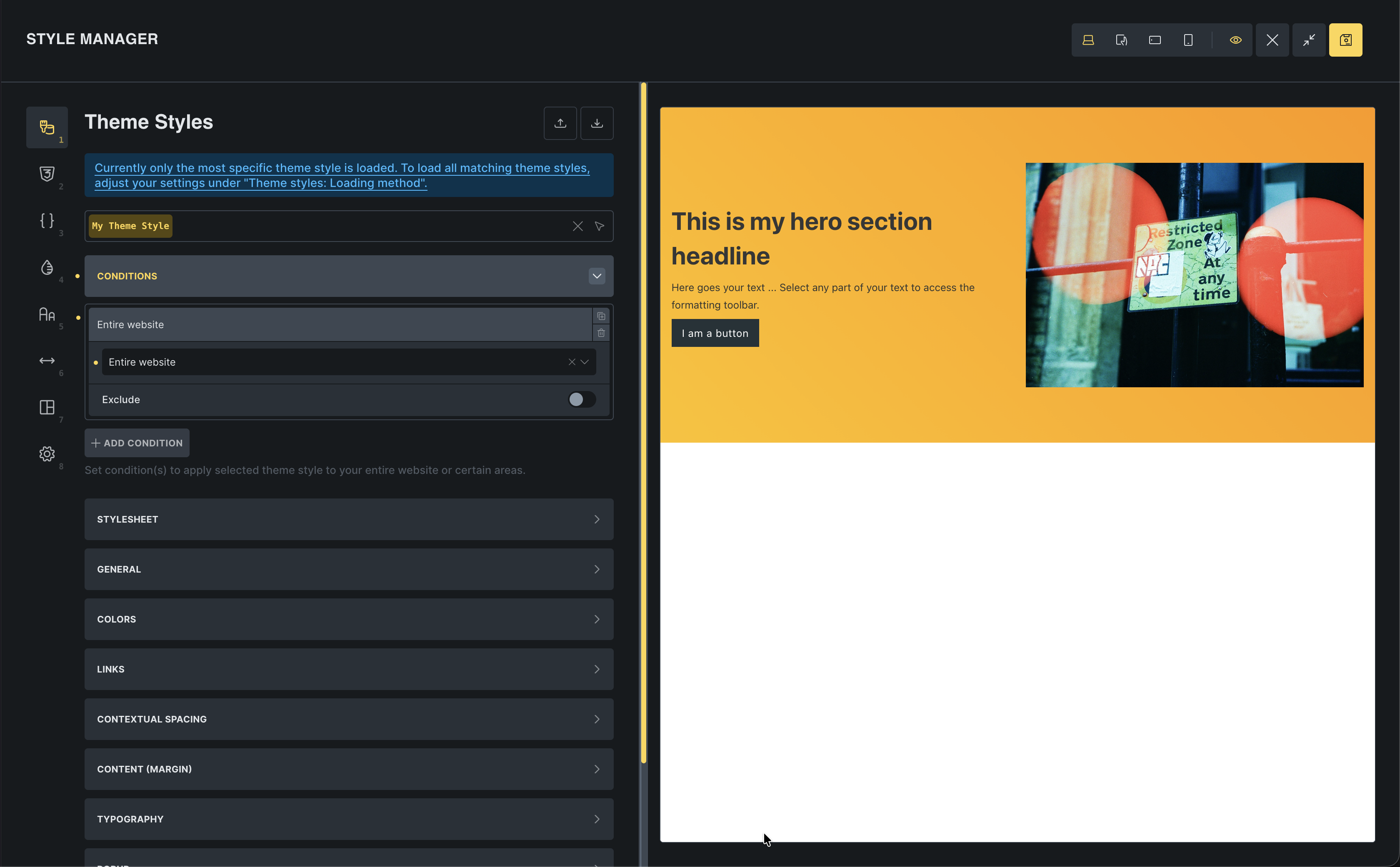
Apply to entire website
Section titled “Apply to entire website”Right now, this style is only visible in the builder. Let’s make it live for the whole site.
- In Theme Styles, go to Conditions
- Click Add Condition
- Select Entire Website
- Click Save in the toolbar
Why this is powerful
Section titled “Why this is powerful”Scalability: If you decide later that sections need 100px padding, you change it once in Theme Styles, and your entire site updates.
Consistency: You never have to remember “was it 60px or 80px?” Bricks handles it for you.
Think of it this way:
- Theme Styles define sensible defaults for your whole site.
- Global classes (later in the series) give you reusable patterns you can apply on demand.
- One-off element styles are for rare exceptions.
Most of your design decisions should live in Theme Styles and classes. That is how you keep sites predictable and easy to change.
Next: templates
Section titled “Next: templates”Now that our global styles are set, let’s look at another powerful global feature: Templates. We’ll use them to build a header that appears on every page.